available for the marketing projectprojects
est.2025→
∞
tầm shan
client:an nguyen
role:branding identity
service:branding identity
year:2023

overview
building a modern milk tea brand inspired by Shan tea culture.
Tầm Shan was born from the desire to bring authentic Shan tea leaves into a contemporary milk tea experience. The brand aims to bridge tradition and modern lifestyle—where highland tea culture meets the fast-paced rhythm of urban life.
Our challenge was to design a brand identity that felt youthful and approachable, yet rooted in cultural depth. Tầm Shan needed a visual language that allowed it to stand out in a saturated milk tea market while clearly communicating quality, origin, and story.
We started by defining the brand essence—“Tầm” as depth and contemplation, “Shan” as origin and heritage—then translated those values into a cohesive and flexible identity system.

problem
Before the branding project, Tầm Shan lacked a clear identity and differentiation. While the product concept was strong, the brand struggled to communicate what made it special beyond being “another milk tea shop.”
Without a distinctive visual system or consistent storytelling, the brand risked blending into a market dominated by trend-driven, short-lived aesthetics. Customers couldn’t immediately grasp the meaning, origin, or value behind the name Tầm Shan.

solution
We designed a complete branding identity that balances cultural storytelling with modern visual appeal.
developed a brand concept inspired by Shan tea highlands, mist, mountains, and tea leaves
designed a distinctive logo system that reflects depth, calmness, and authenticity
created a modern color palette combining earthy tones with youthful accents
exestablished typography and graphic patterns that feel contemporary yet grounded
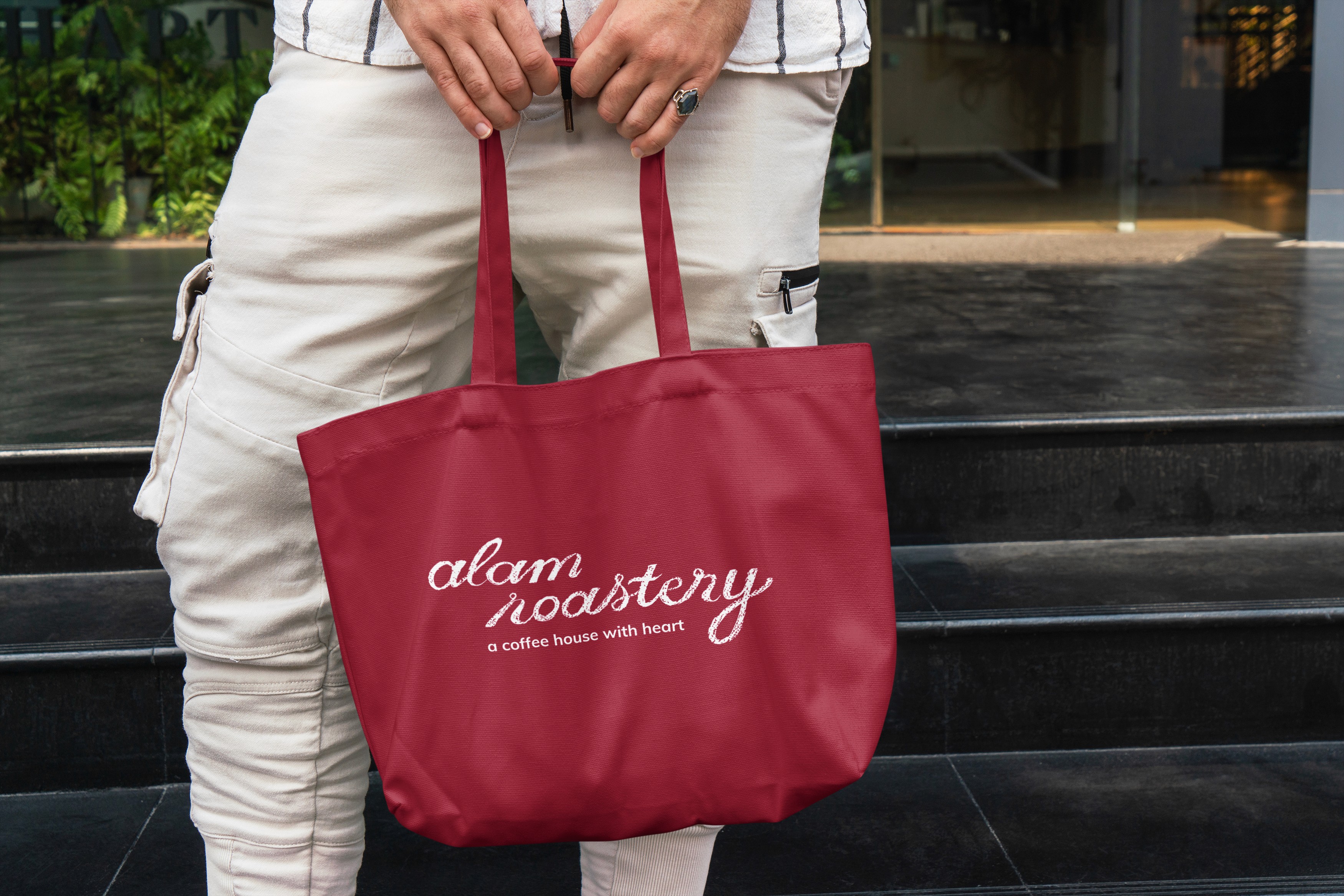
applied the identity across key touchpoints: packaging, cups, menu boards, and digital media
The identity system was built to be flexible, scalable, and instantly recognizable—supporting both storytelling and commercial growth.

result
from a generic milk tea concept to a brand with depth and character.
After launch, Tầm Shan emerged as a brand with a clear voice and strong visual presence. Customers could immediately recognize the difference—not just in taste, but in story and atmosphere.
The new branding helped position Tầm Shan as a thoughtful, quality-driven milk tea brand, attracting younger audiences while earning trust from tea lovers who value origin and craftsmanship.

client feedback
This was the refresh I didn’t know I needed. They captured my design process so well and gave me a professional platform I’m proud to share. I’m landing better projects and more confident pitching clients.

An Nguyen Founder Tầm Shan
gallery showcase