available for the marketing projectprojects
est.2025→
∞
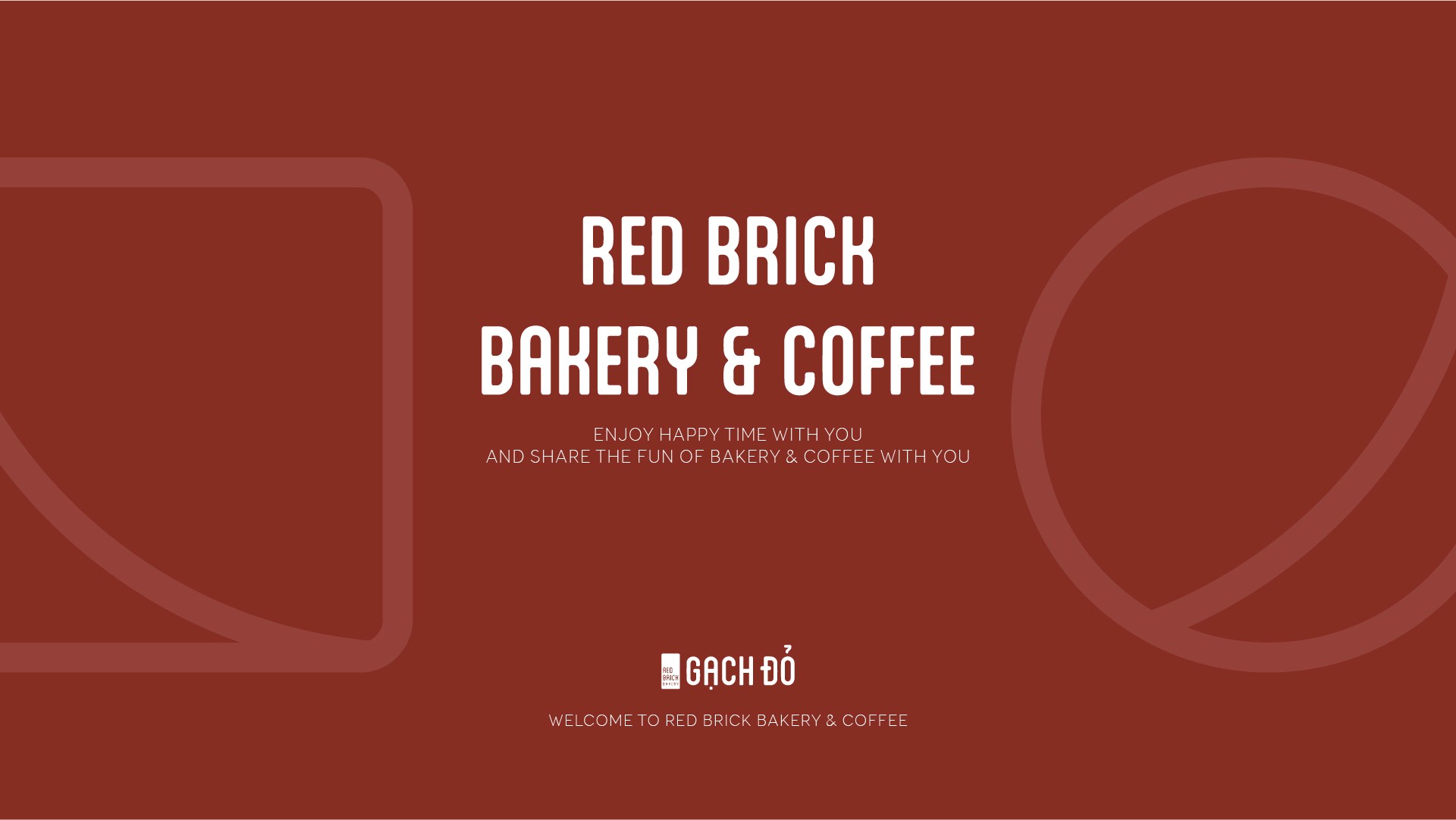
gạch đỏ bakery & coffee pattern
client:an nguyen
role:brand refresh, pattern design
service:pattern branding
year:2022

overview
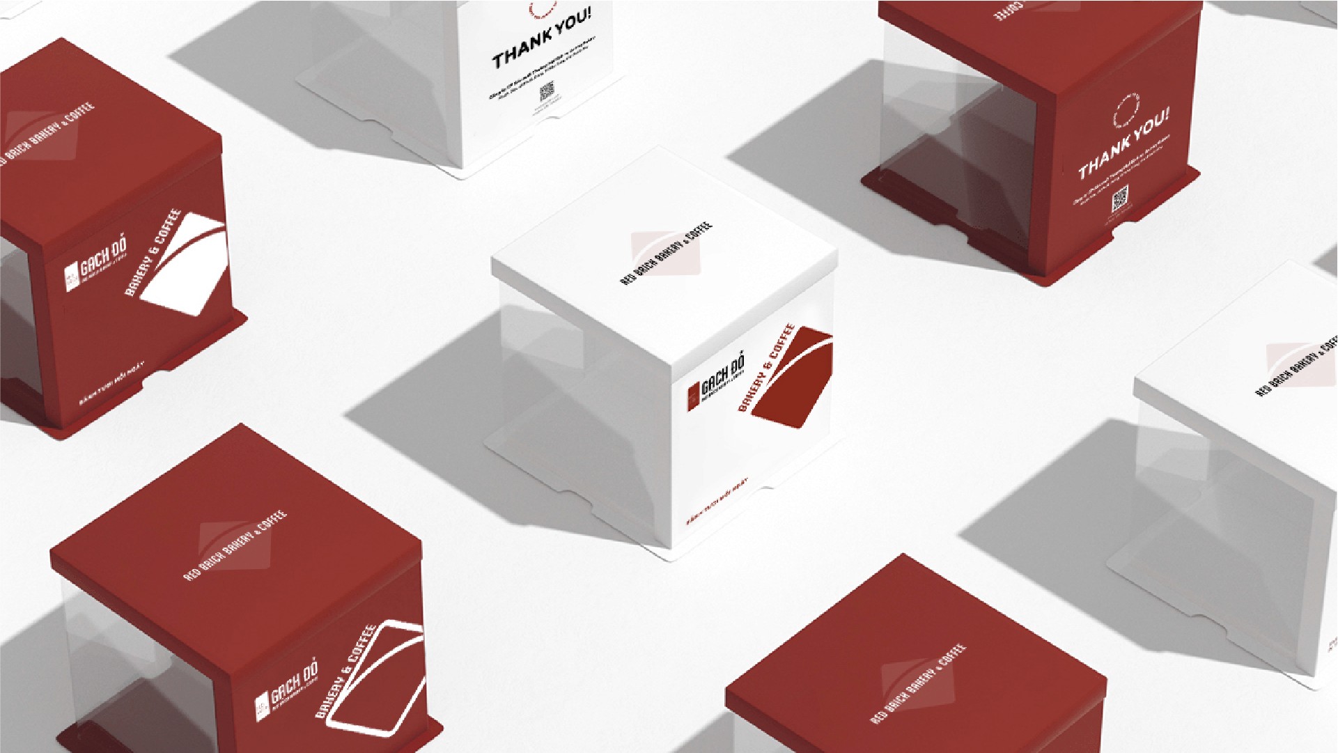
designing a signature visual pattern to strengthen brand recognition and storytelling.
Gạch Đỏ is an established brand with a strong identity rooted in craftsmanship, authenticity, and local culture. While the core brand elements were already in place, the challenge was to develop a distinctive visual pattern system that could elevate recognition, add emotional depth, and consistently express the brand’s story across touchpoints.
The goal was not to redesign the brand, but to enhance it—creating a pattern language that feels unmistakably “Gạch Đỏ” while supporting both functional applications and narrative expression.
We approached the project as a translation of values into form, using patterns as a storytelling medium rather than decoration.

problem
Although Gạch Đỏ had a clear brand foundation, its visual applications lacked a unifying graphic element that could scale across environments and materials.
Without a signature pattern system, the brand relied heavily on logo usage alone, limiting visual impact and memorability. There was also an opportunity to communicate Gạch Đỏ’s deeper story—its connection to material, heritage, and process—in a more subtle, expressive way.
The challenge was to design a pattern that felt meaningful, timeless, and adaptable, rather than trendy or ornamental.

solution
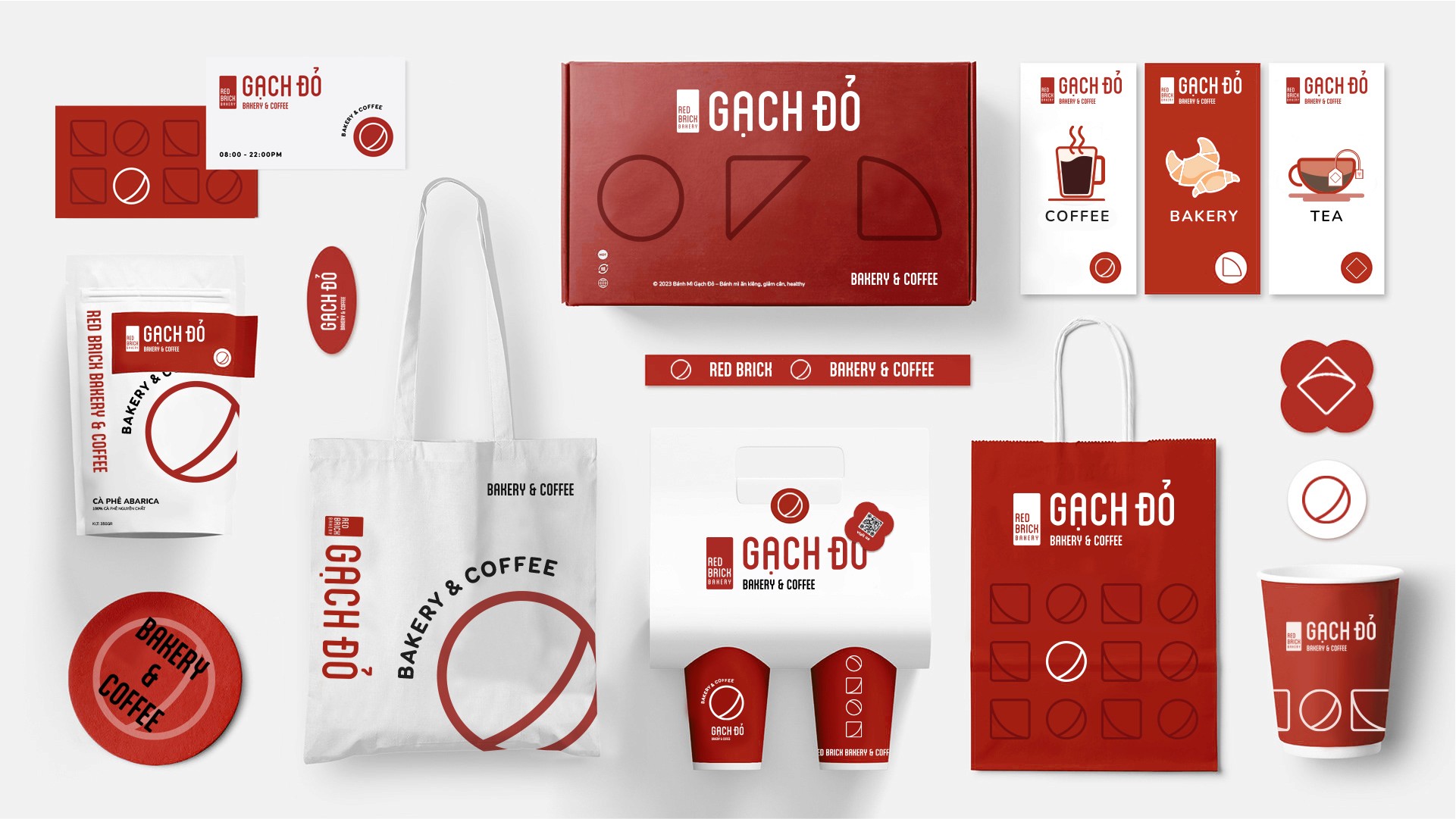
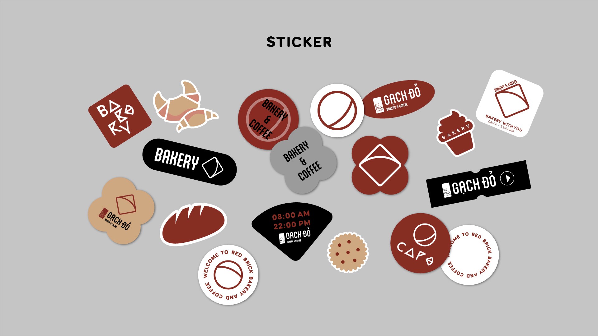
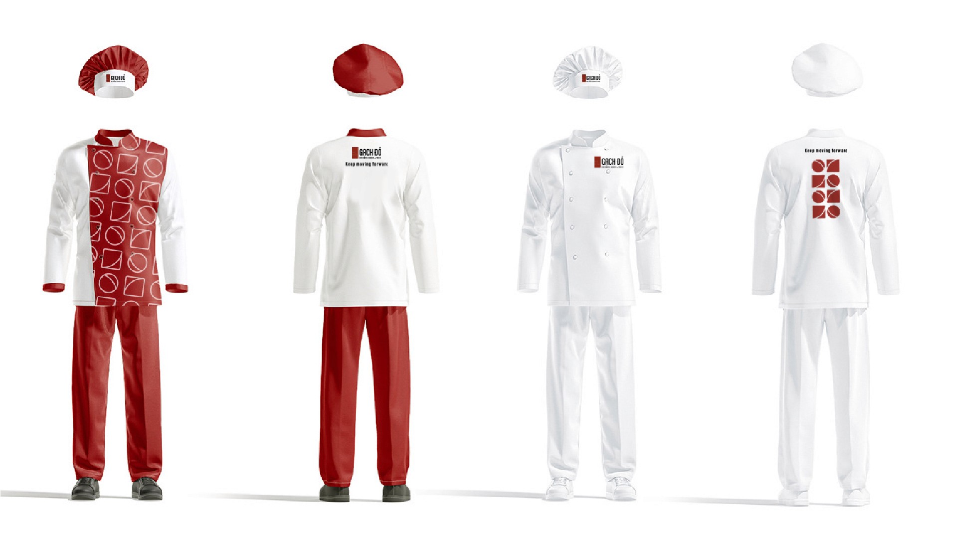
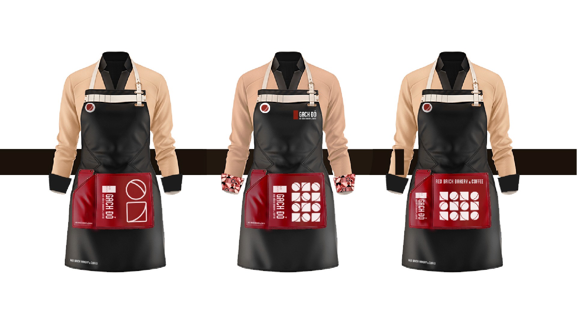
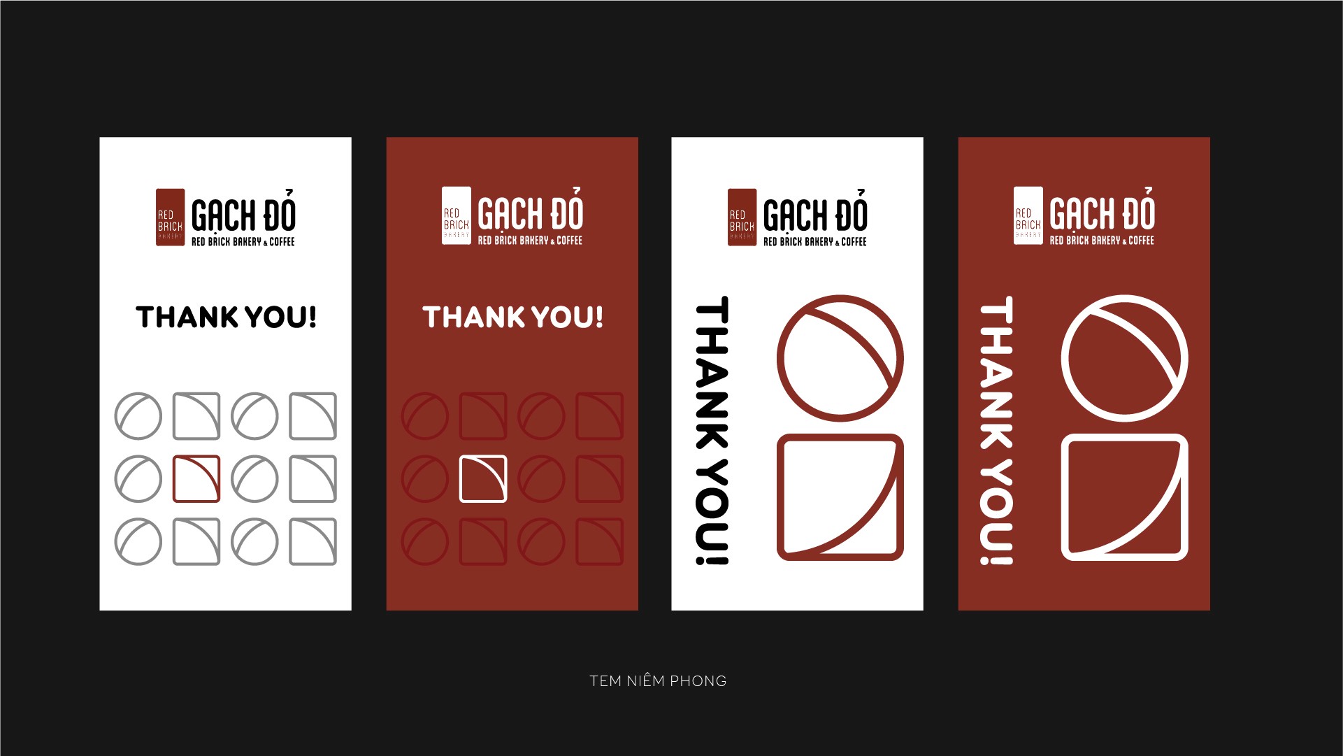
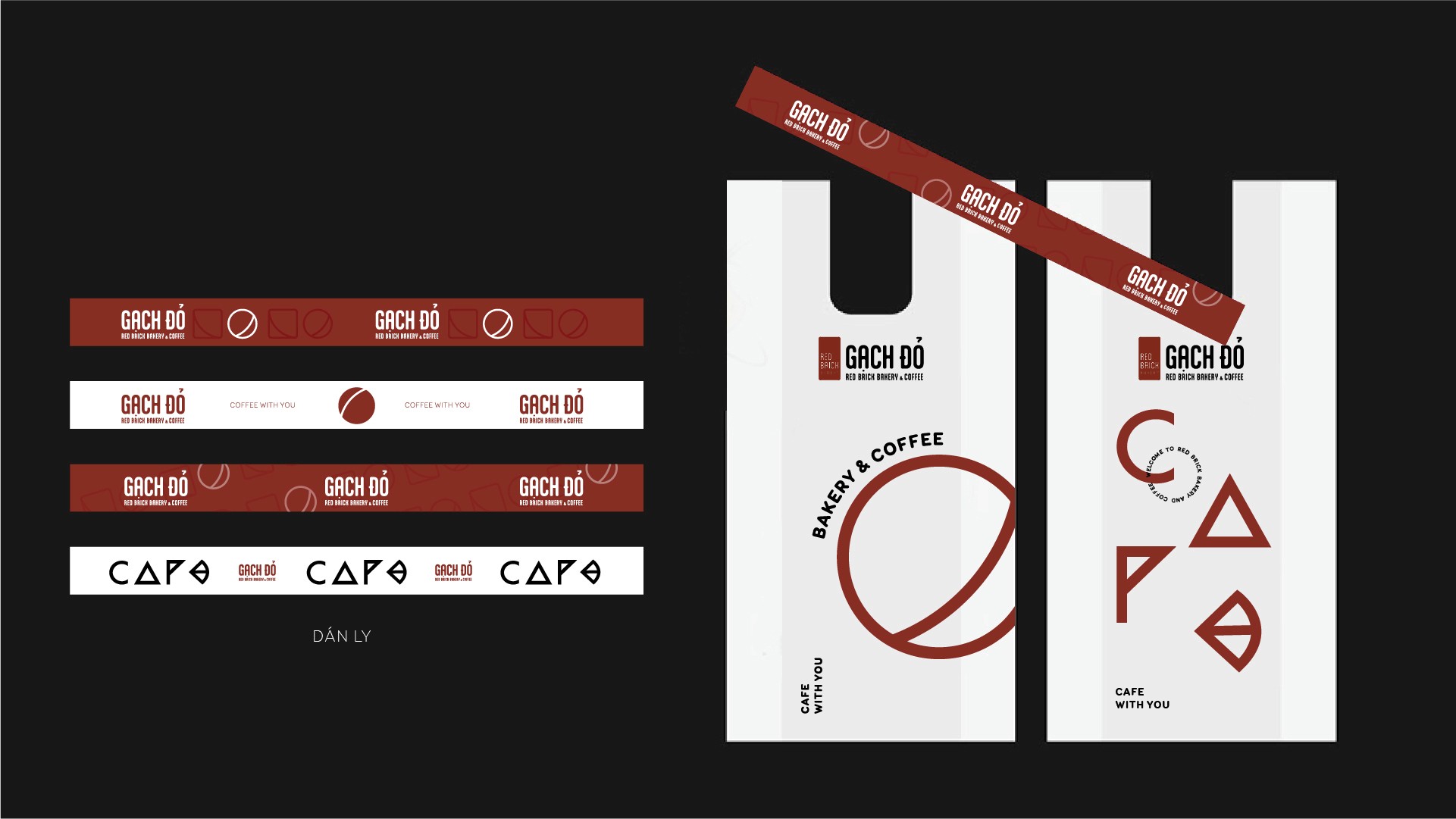
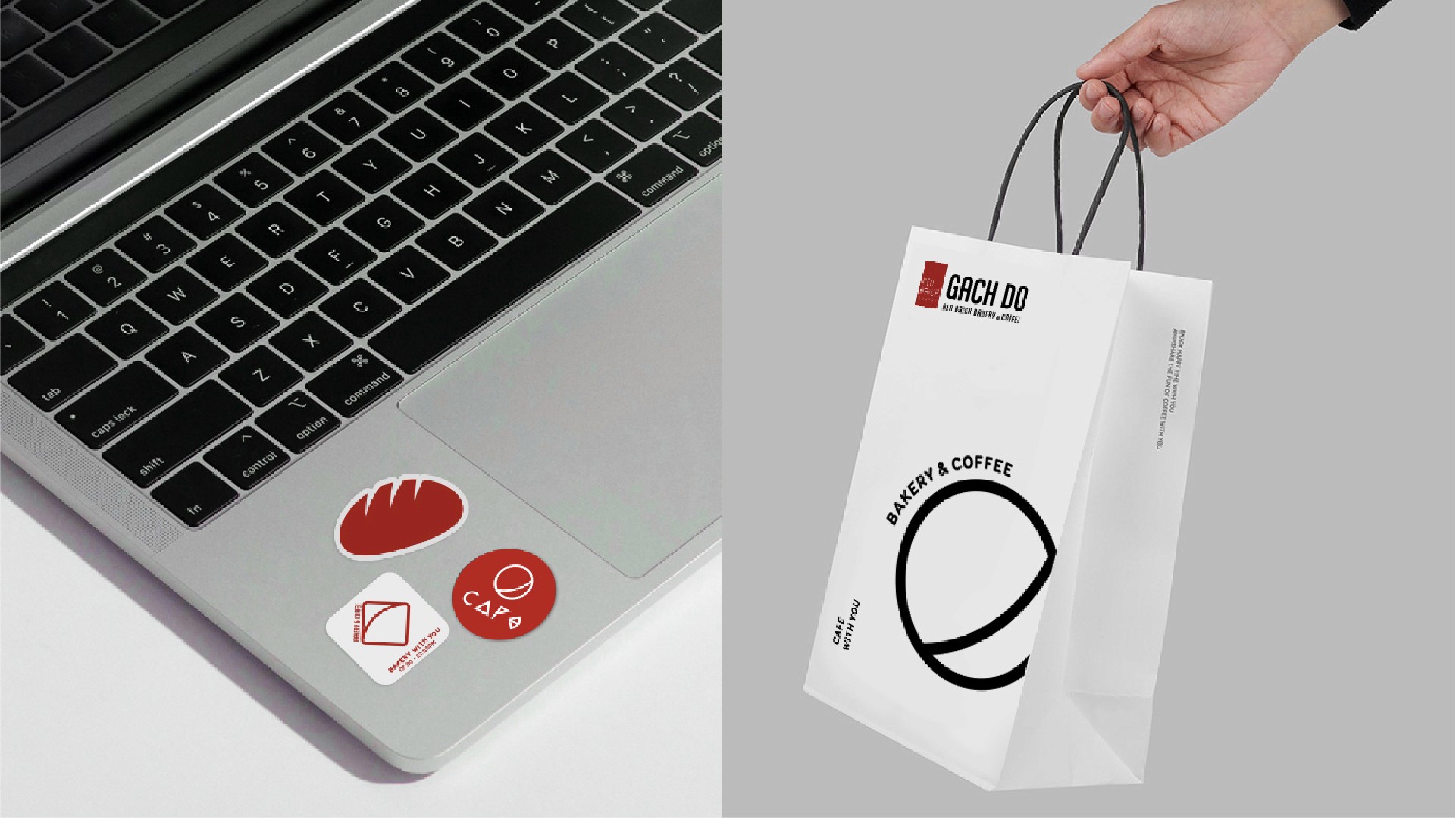
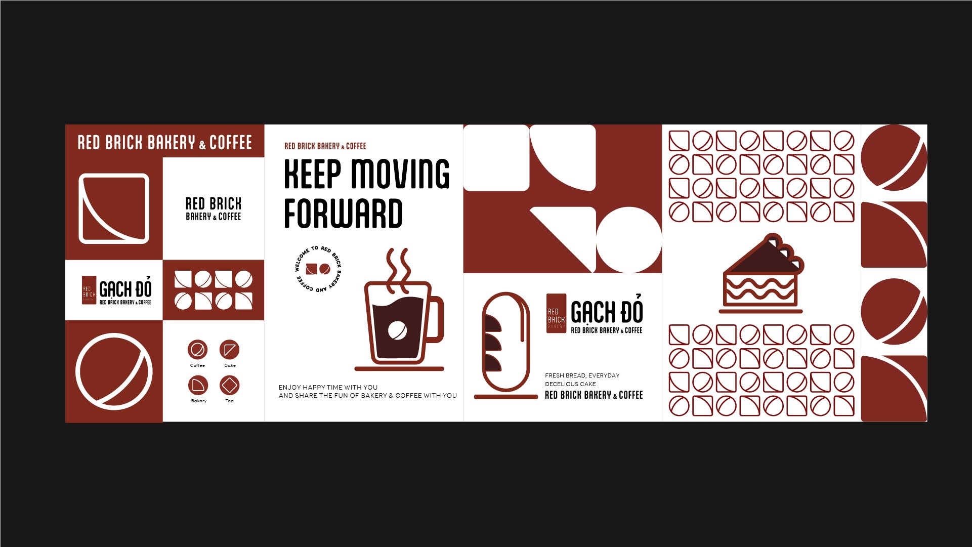
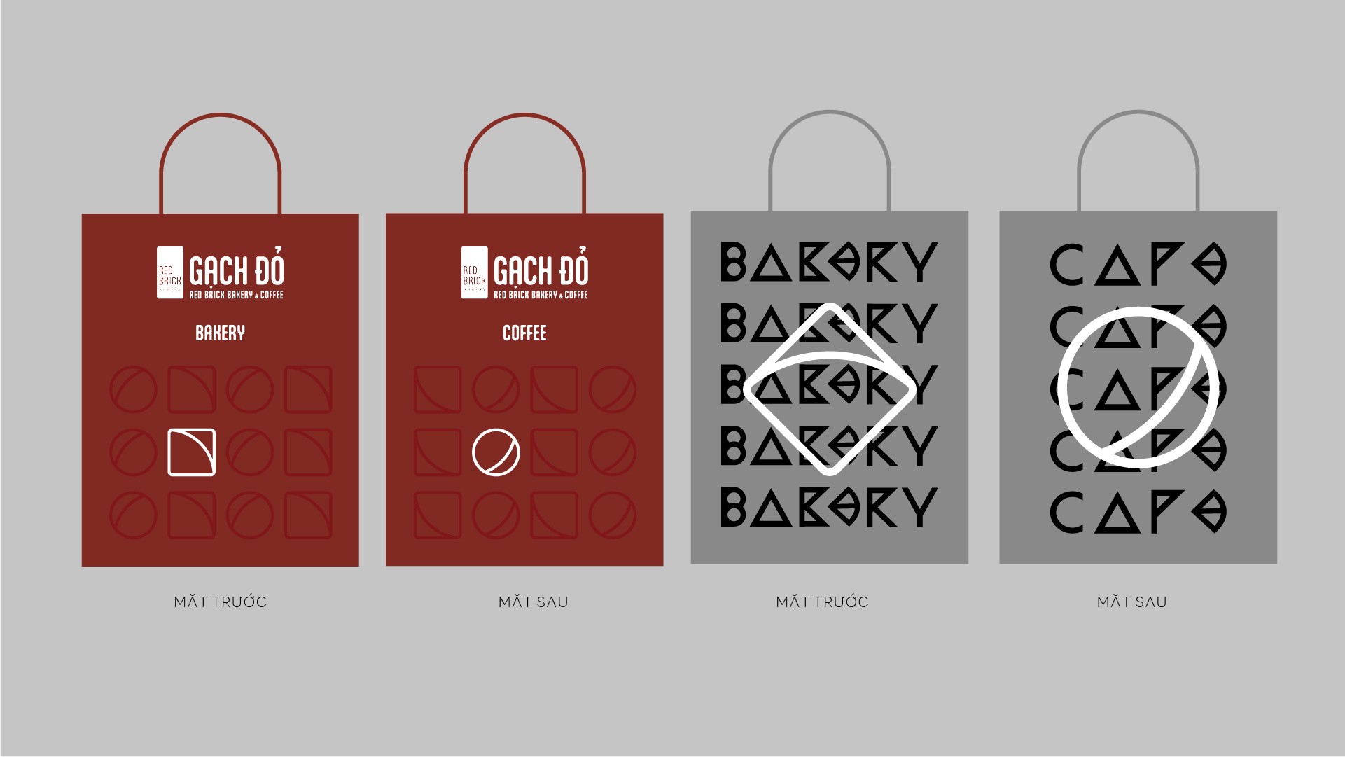
We designed a custom visual pattern system inspired by the essence of Gạch Đỏ material honesty, repetition, and the rhythm of craftsmanship.
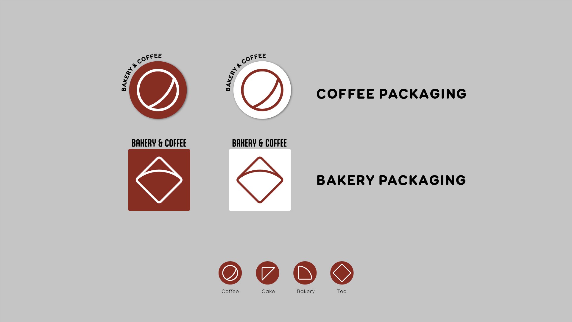
- developed modular pattern units derived from brick geometry and construction logic
- translated brand values into visual rhythms, repetition, and texture
- balanced bold structure with refined details to ensure versatility
- created multiple pattern densities for different use cases
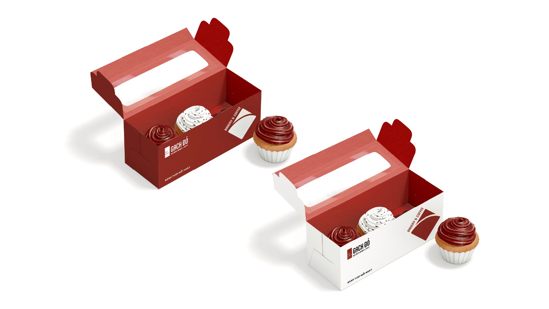
- ensured seamless integration with the existing logo, typography, and color system
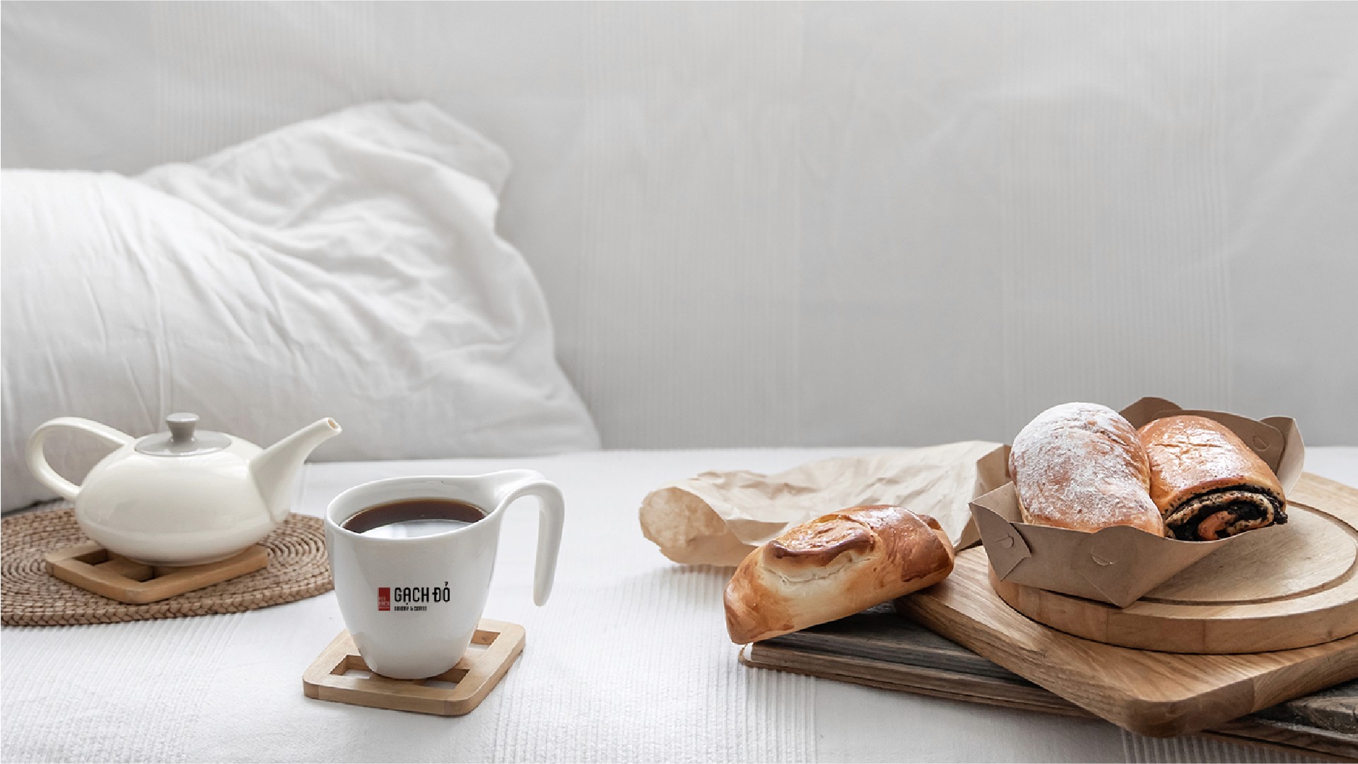
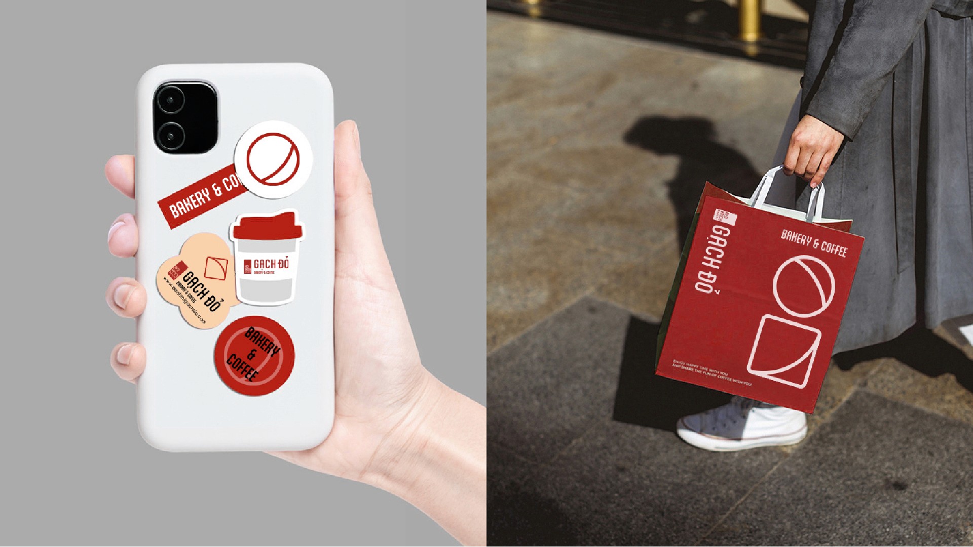
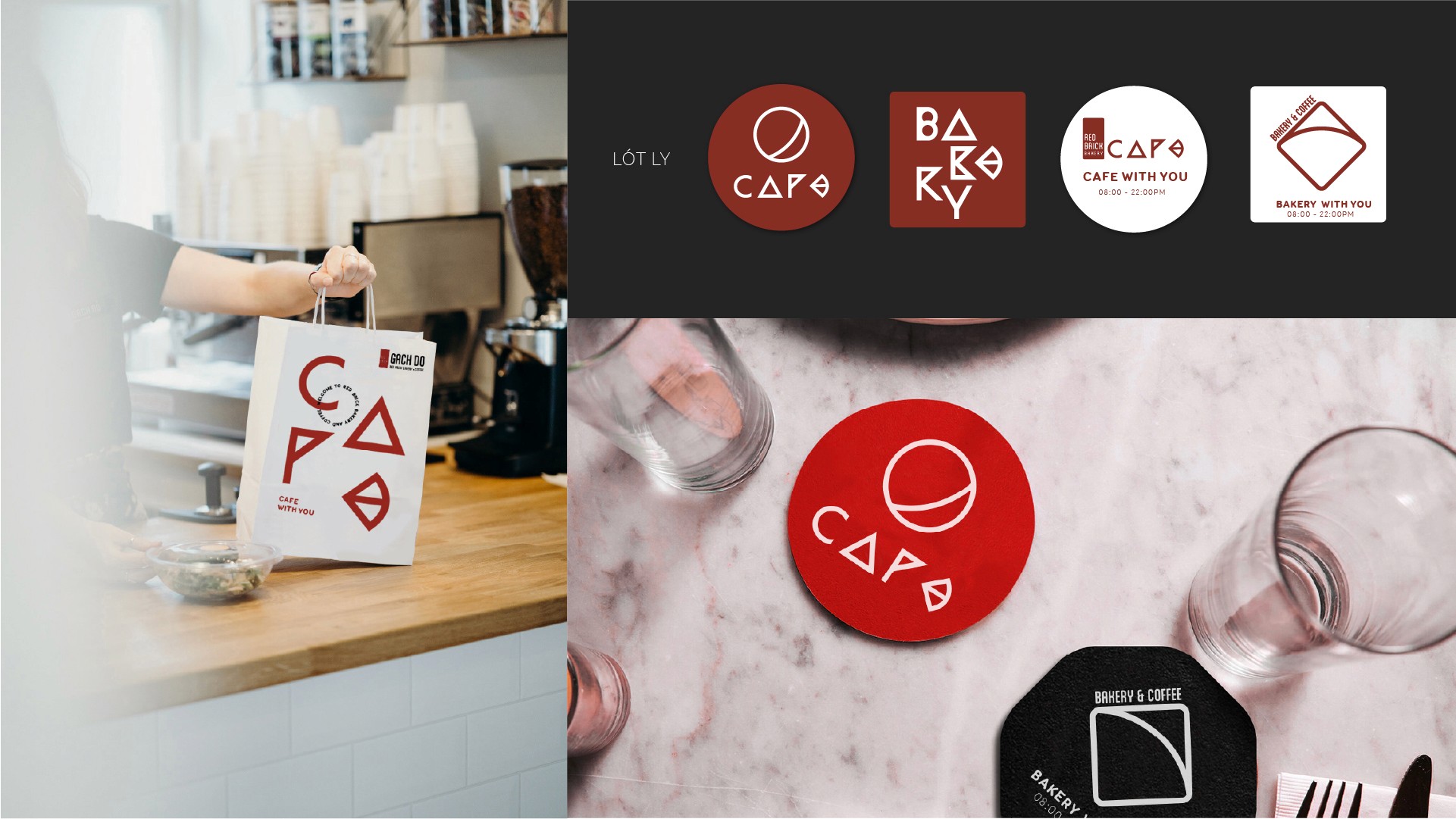
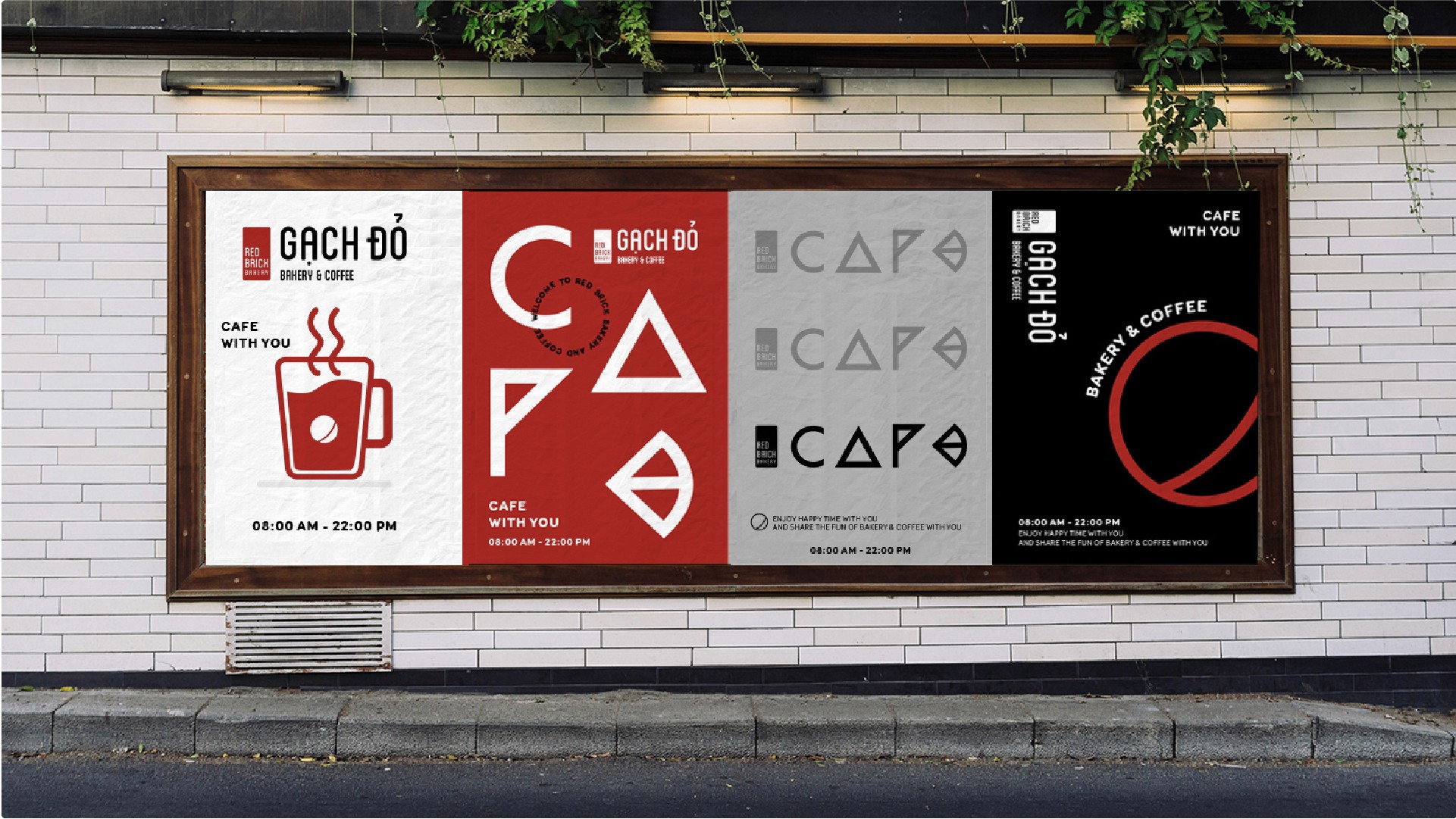
The pattern system was designed to function as both a background element and a storytelling layer—subtle when needed, expressive when featured.

result
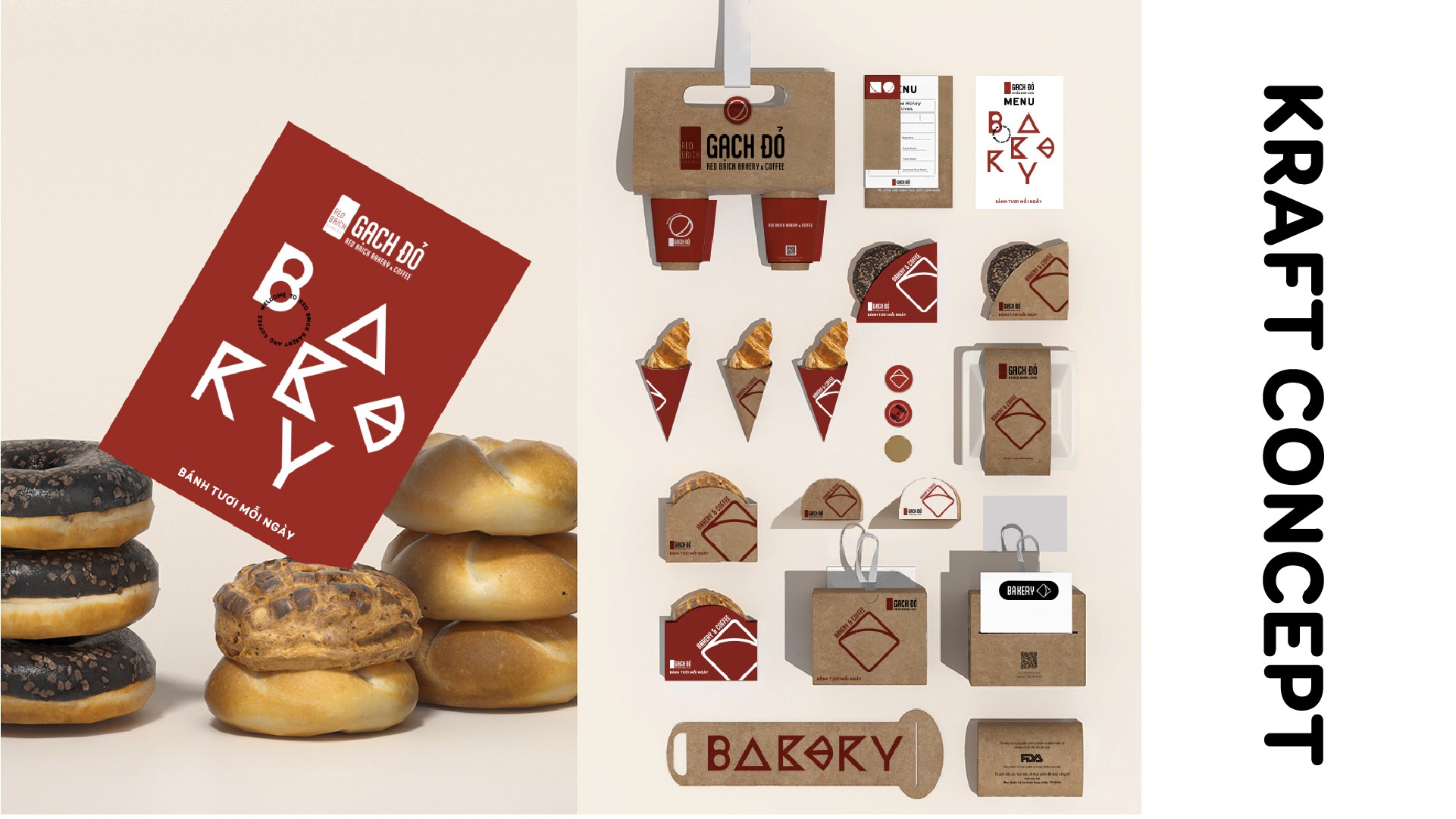
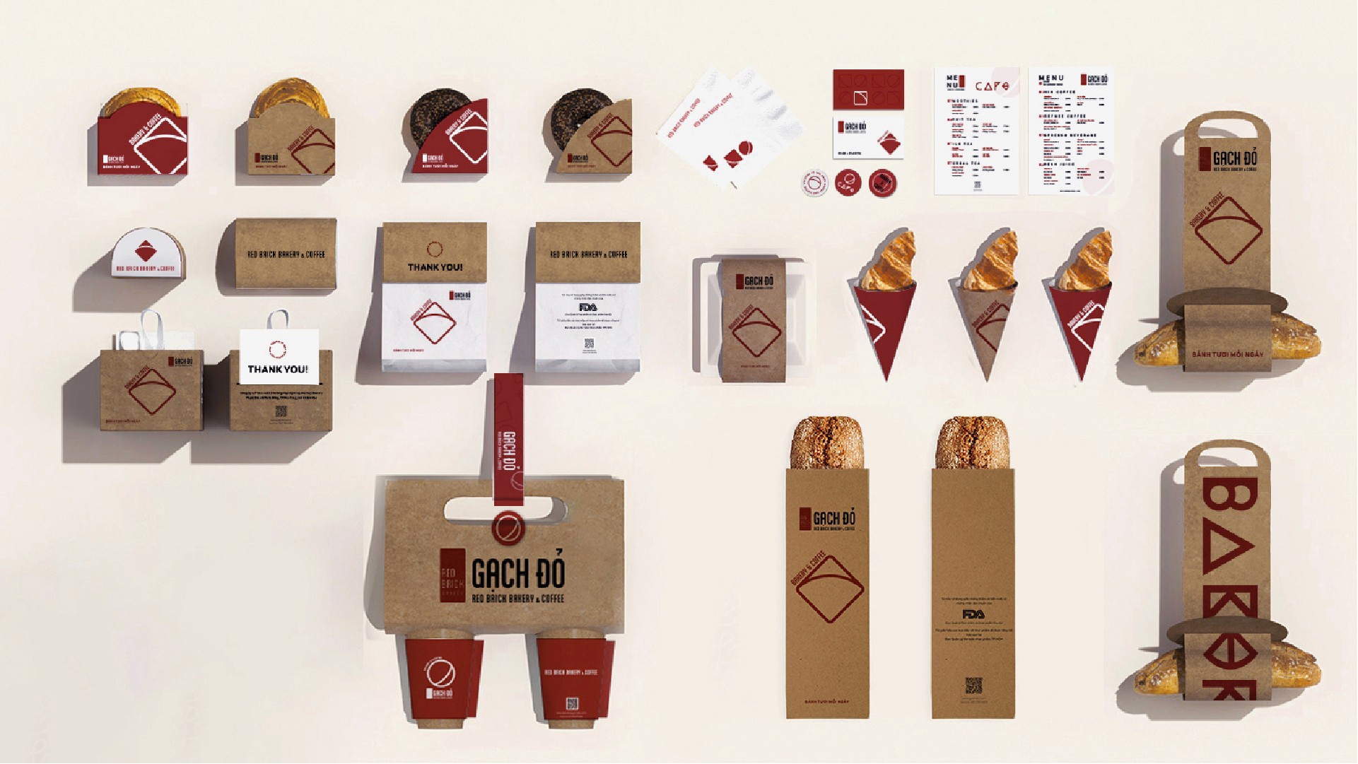
a recognizable visual language that extends the brand beyond the logo.
The new pattern system strengthened Gạch Đỏ’s visual identity across physical and digital touchpoints. It added depth, consistency, and emotional resonance—making the brand more recognizable even without direct logo presence.
By embedding story and structure into the patterns, Gạch Đỏ gained a flexible design asset that supports long-term brand growth while staying true to its roots.
- increased visual consistency across applications
- enhanced brand recall through a distinctive graphic signature
- allowed richer storytelling without relying on copy
- supported scalable use across print, packaging, interiors, and digital media

client feedback
“The pattern feels like a natural extension of Gạch Đỏ—quiet, solid, and intentional. It doesn’t shout, but it stays with you. It finally gives our brand a visual rhythm that tells our story.”

an nguyenFounder Gach Do
gallery showcase